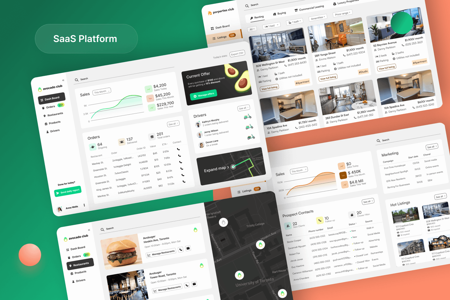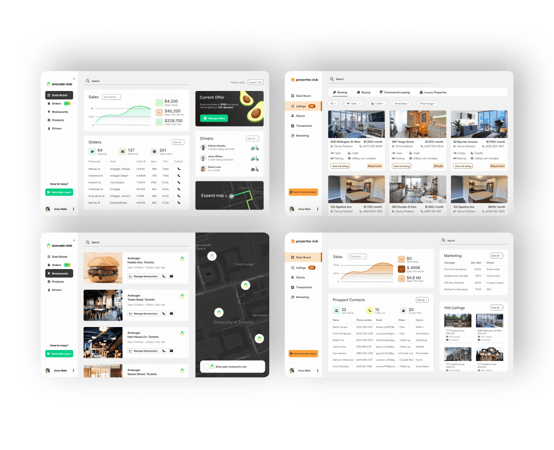
A collection of high-fidelity desktop and mobile UI mockups showcasing a cross-industry SaaS dashboard. The layouts include a dark-themed delivery tracking map with live driver locations, a restaurant management dashboard displaying sales analytics and hot orders, a clean property listings matrix for real estate agents with high-quality interior images, and a comprehensive CRM client communications pipeline

INCOR / 2025

UX/ UI Designer


About project

SaaS platform that facilitate seamless management of products, clients, and sales of businesses across various industries.

What I did

Market Research

Competitive analysis

User survey

Flow diagrams

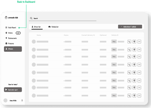
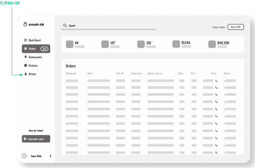
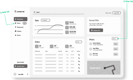
Wireframes

Prototype

High-fidelity UI

Accessibility evaluation

Market Research

The Data

The SaaS industry has experienced significant growth over the past decade. According to a report by Grand View Research, the global SaaS market size was valued at over USD 158 billion in 2020 and is expected to reach USD 307.3 billion by 2028, with a compound annual growth rate (CAGR) of 10.5%.

The Problem

Businesses such as real estate agents and food chains encounter challenges in effectively managing vast amounts of client and product information due to the sheer volume involved.
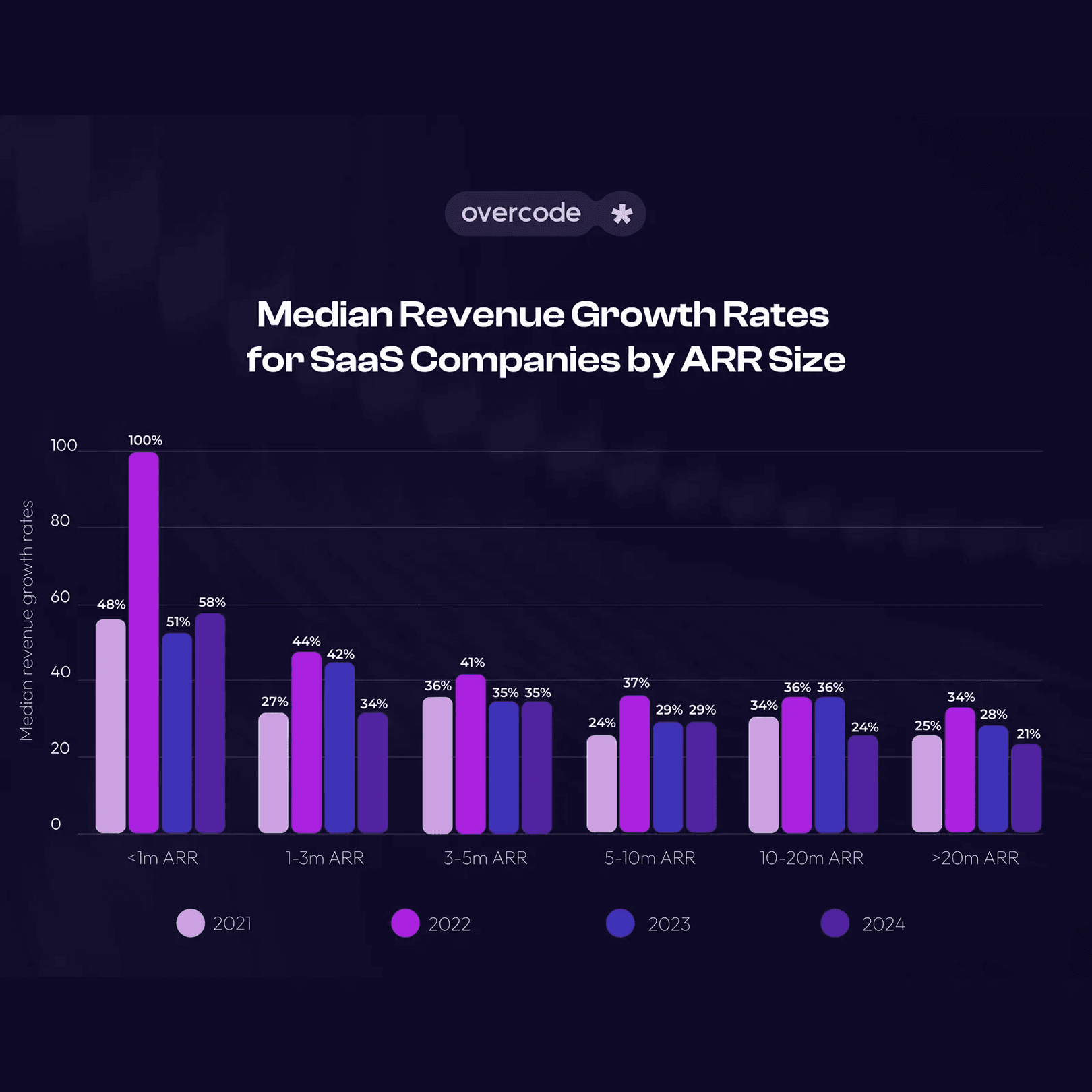
A dark blue rectangular graphic displaying a financial data chart titled 'Median Revenue Growth Rates for SaaS Companies by ARR Size,' featuring a vertical bar graph mapping growth percentages against annual recurring revenue milestones.

Competitive Analysis

I analysed 3 most popular platforms in the field - looking both at the user experience and negative app store comments to find patterns

logo of propery base
zillow premier agent logo logo.dev
uber eats logo logo.dev

Propertybase

Zillow Premier Agent

Uber Eats for Restaurants

The good

All platforms allows users to contact their clients by email or phone number and view their sales data for the month.

The bad

There’s no way to control the discount offer ( Uber), CRM and listings are not in sync ( Zillow Premier Agent), and there’s no way to compare effectiveness rate of marketing email ( Property Base)

Problems from the comments

I can’t control manage the discount offers. Even updating menu you I had to call customer support.

woman wearing black crew-neck shirt

LAURA

Propertybase User

I can’t control manage the discount offers. Even updating menu you I had to call customer support.

woman wearing black crew-neck shirt

LAURA

Propertybase User

I wish it can keep both CRM and properties listings in sync and better interface design.

man standing near white wall

JOHN

Zillow Premier User

I wish it can keep both CRM and properties listings in sync and better interface design.

man standing near white wall

JOHN

Zillow Premier User

Not that great for email marketing. I can’t see and compare which emails work best.

man in black crew neck shirt

MATT

Uber Eats User

Not that great for email marketing. I can’t see and compare which emails work best.

man in black crew neck shirt

MATT

Uber Eats User

User Survey

I conducted a survey among real estate agents or restaurant manager who needs a solution to manage their business more efficiently on Facebook.

What’s the most important factor you take into account when using a platform to manage your business?

7

participants

Price

25%

Features

31%

Ease of Use

34%

Integration and Compatibility

10%

Notable Comments

For me, the most important is to save all the information of my clients!

closeup photography of woman smiling

HANA

Propertybase User

The platform we currently use make it hard for me to navigate to control my property listings.

woman in white crew neck shirt smiling

Marina

Zillow Premier User

I wanna see the dashboard of all marketing campaigns that I run in one place.

men's gray crew-neck shirt

JOHN

Uber Eats User

Initial research shows

An increasing demand exists for a user-friendly, cost-effective solution that allows businesses to handle their products and customer data efficiently.

Flow Diagram

To out line all the necessary functionality I created a simple flow diagram of the main tasks users can do. One of the flows is shown below.

Main Client Flow
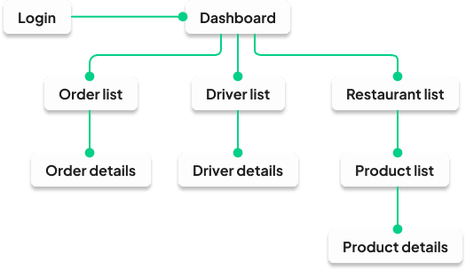
A detailed UX user flow diagram outlining the system architecture for client management. The flowchart connects rectangular action blocks with arrows, mapping the user journey from viewing the main dashboard, filtering product inventories, tracking real-time client sales communication, and generating custom discount codes or email marketing campaigns.

Low-fidelity Wireframes

Once the flow is established , I stared creating the low-fidelity wireframes of the main flow.
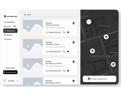
A monochrome low-fidelity desktop wireframe detailing the main analytics dashboard interface. It features a thin left-hand navigation sidebar and a spacious content arena containing three small, rectangular KPI metric blocks stacked horizontally above a massive, wide placeholder card meant for primary data charts or performance graphs
A monochrome low-fidelity desktop wireframe illustrating a systemized data management or client log view. The top zone features nested search and filter inputs with clean rectangular borders, positioned over a dense vertical data table containing multi-line text blocks, interactive checkbox components, and action link placeholders.
A monochrome low-fidelity desktop wireframe displaying a split-screen operational layout. The left half of the grid is dominated by a substantial, framed square placeholder designed for an interactive logistics map or asset visualization, paired with a right-side panel layout stacked with secondary metric counters and input fields.
A monochrome low-fidelity desktop wireframe outlining an individual record detail configuration or user editing layout. The design features a header section detailing specific entity details, which sits directly above an organized matrix of multi-column text rows, data tables, and structured text fields for modifying product settings.

High-fidelity UI Design

Once the initial flow was complete. I started by creating a couple of the main screens of the app. I started by defining the fonts and colors

Color palette

Accent, primary, secondary, background

Main CTA button color

Font

Plus Jakarta Sans
AaBbCcDdFfGgHh

AaBbCcDdFfGgHh

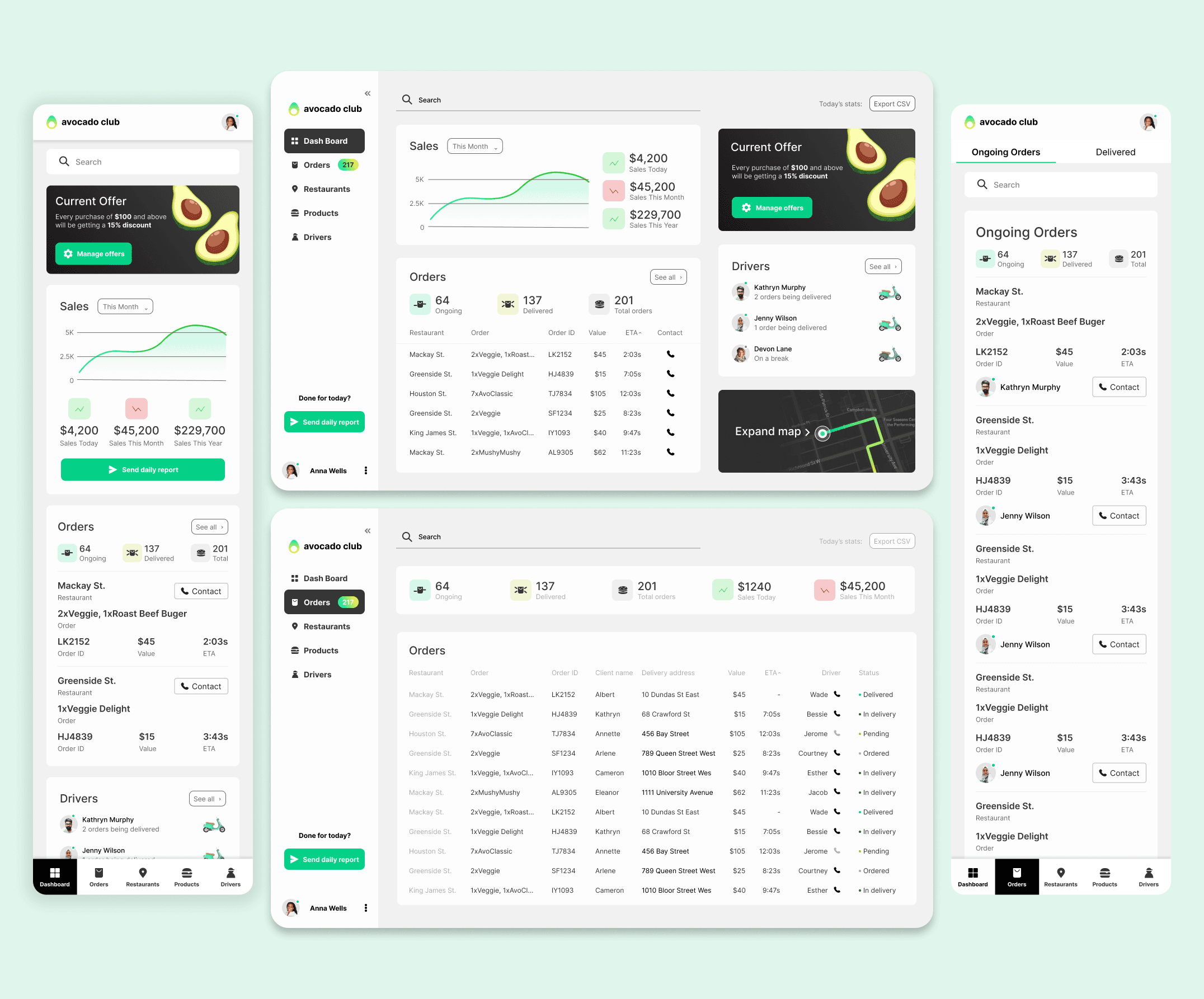
A UX/UI design showcase section titled 'Figma File' presenting a collection of high-fidelity desktop and mobile application layouts against a clean cream background. The top left features a minimalist style guide outlining a typography system set in 'Plus Jakarta Sans' next to circular UI color palette swatches, highlighting a vibrant green circle designated as the 'Main CTA button color.' Arranged below the design assets are multiple polished operational dashboards, including a dark-themed logistics delivery tracking map displaying vehicle routes, a white real estate listings grid featuring thumbnail photos of modern properties, and an analytical management platform layout showing sales performance graphs, client communication message threads, and active order pipelines.

High-fidelity dashboard screens for a multi-user business management platform serving restaurant and real estate workflows.

Figma File

A snapshot of my Figma file.
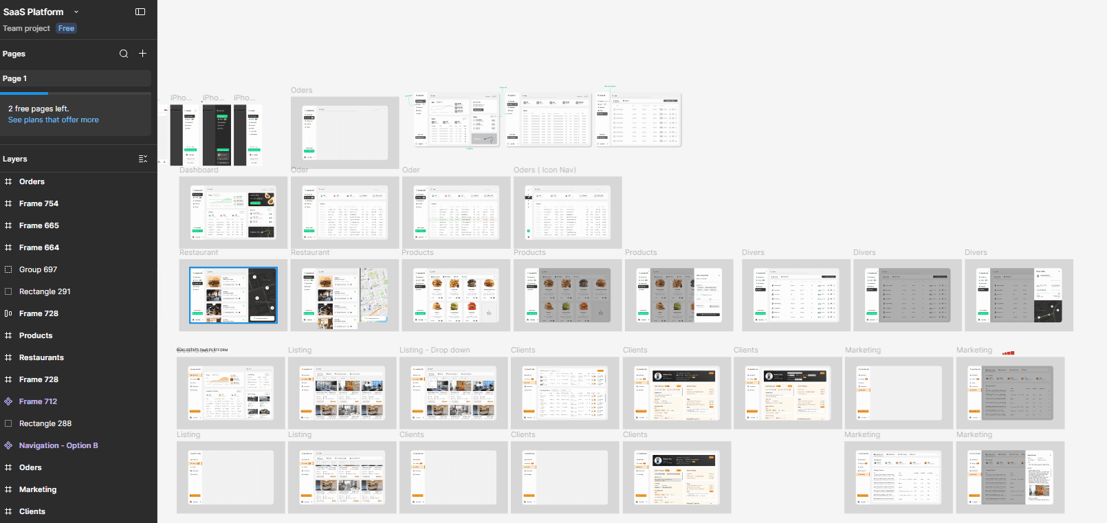
A comprehensive snapshot of a Figma design workspace displaying a grid of numerous user interface wireframes and artboards for the SaaS platform. The left side panel shows a dark mode layers and pages hierarchy list. The main canvas area organizes dozens of interface designs into structured rows and columns according to user flows—including initial wireframe concepts, component asset testing, mobile app screens, and full-width desktop operational dashboards mapping out real estate management matrices and restaurant delivery tracking analytics grids.

Create a free website with Framer, the website builder loved by startups, designers and agencies.