Miniature Exhibition App
INCOR / 2025
UX/ UI Designer
About project
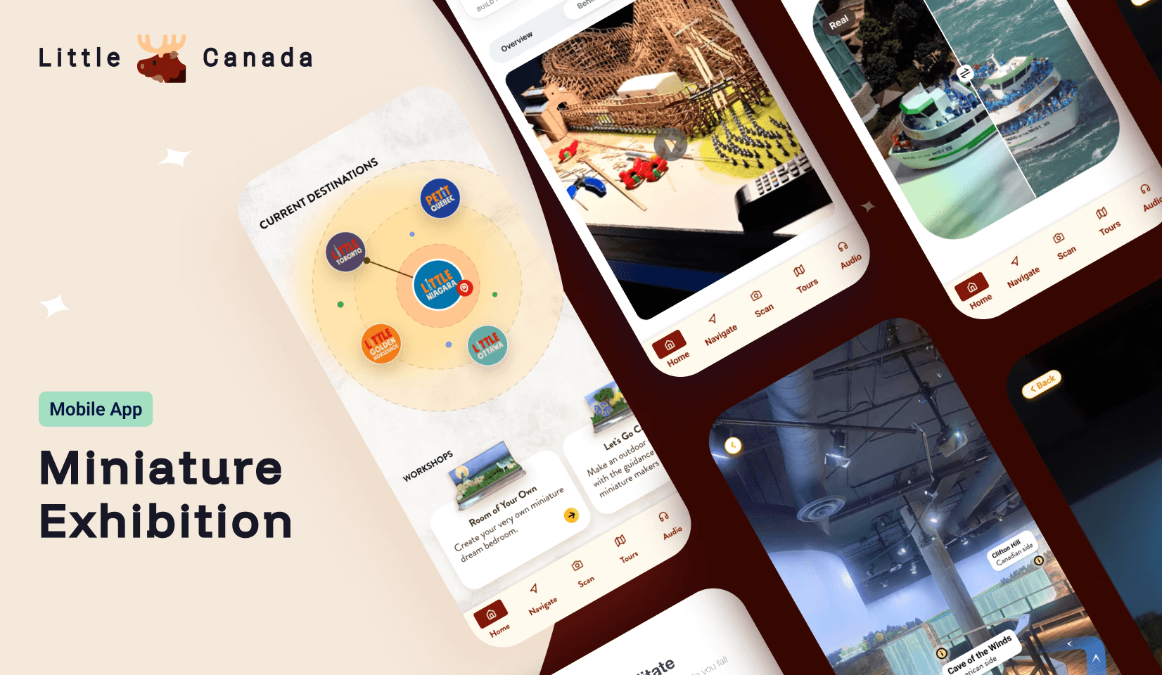
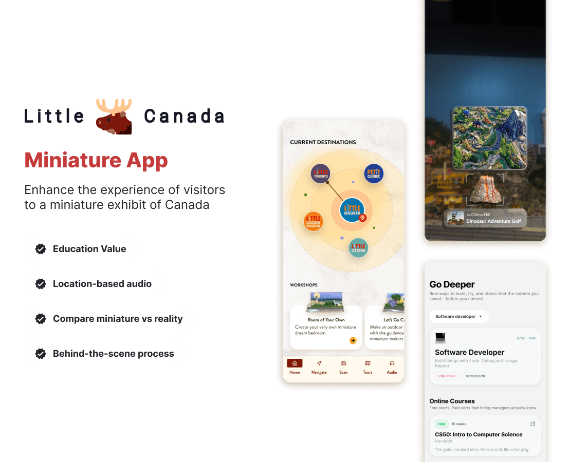
A mobile application designed to enhance the experience of visitors to a miniature exhibit of Canada. Instead of acting like a traditional guide, the app transforms the experience into an immersive, personalized journey combining ambient storytelling, interactive learning, and visual comparison.
What I did
Market Research
Competitive analysis
User survey
Flow diagrams
Wireframes
Prototype
High-fidelity UI
Accessibility evaluation
Market Research
The Problem
The miniature exhibit encounters challenges in providing background information to visitors due to the limited physical space available for detailed displays.
The Hypothesis
If there is a platform providing information about miniatures, including detailed historical context, interactive features, and educational content, then visitor engagement and understanding of the miniatures will increase, leading to higher satisfaction and repeat visits to the exhibit
Competitive Analysis
I analysed 3 most popular platforms in the field - looking both at the user experience and negative app store comments to find patterns


ROM Mobile Tours
Toronto Zoo
CN Tower Viewfinder
The good
All platforms provide users with information about what they are viewing
The bad
There’s limited visual illustrations (ROM), no scanning feature ( Toronto Zoo), and limited information ( CN Tower Viewfinder)
Problems from the comments



User Survey
I started with the hypothesis that creating app that users can view information of the miniature would help enhance experience and engagement. To test my hypothesis, I interviewed miniature visitors to understand their preferrences.
What’s the most important factor you take into account when visiting a miniature exhibit?
23
participants
Interactive Elements
80%
Building Process
75%
Architectural Comparisons
60%
Educational Value
34%
Notable Comments
It would be so immersive if I could put on my headphones and 'tune in' to a specific scene. Like, if I point my phone at the tiny rock concert, I should hear the ambient audio or music from that specific spot.

LAURA
Guest
I found myself constantly Googling pictures of the real Union Station to see if they got the number of windows right. The app should just have a side-by-side gallery of the real building's architecture versus the model

KATE
Guest
Show me how they built the tiny CN Tower. The app should have a 'Behind the Build' section for each area—tell me how many thousands of hours it took to paint, how many tiny people are in the stadium, and what materials they used.

JOHN
Guest
Initial research shows
The MVP app features an interactive audio guide that provides location-based ambient sounds and a "Behind the Build" section showcasing technical craftsmanship and construction materials. It also includes a side-by-side gallery for real-world architectural comparisons and customizable filters that allow users to select specific information categories based on their interests.
Flow Diagram
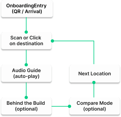
To out line all the necessary functionality I created a simple flow diagram of the main tasks users can do. One of the flows is shown below.
Main Client Flow
Low-fidelity Wireframes
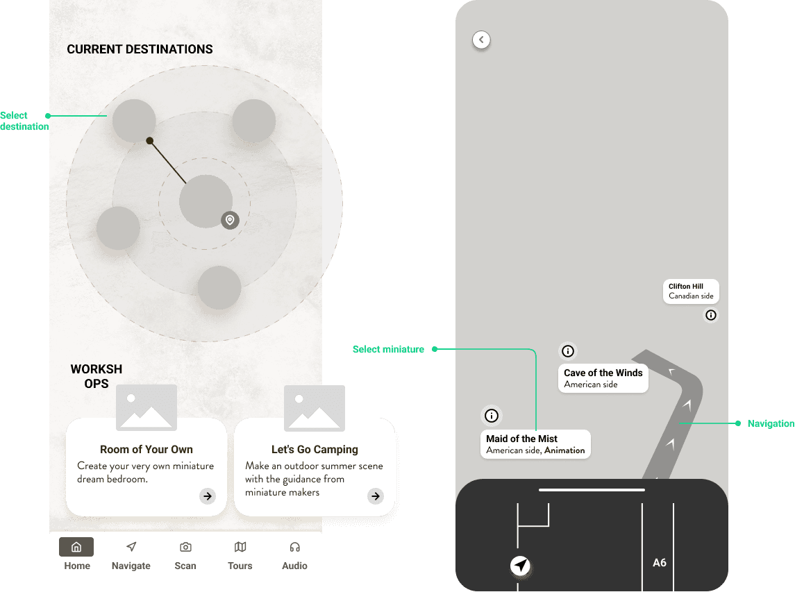
Once the flow is established , I stared creating the low-fidelity wireframes of the main flow.
High-fidelity UI Design
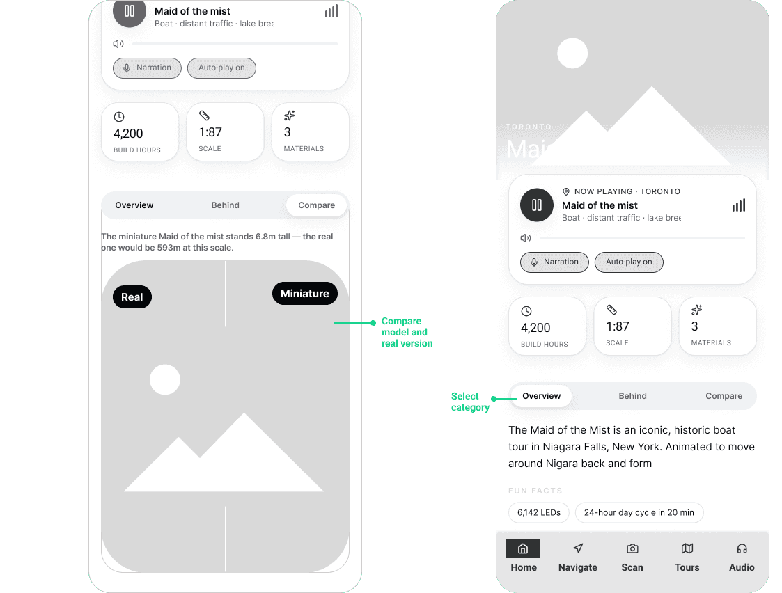
Once the initial flow was complete. I started by creating a couple of the main screens of the app. I started by defining the fonts and colors
Color palette
Accent, primary, secondary, background
Main CTA button color
Font
Roboto
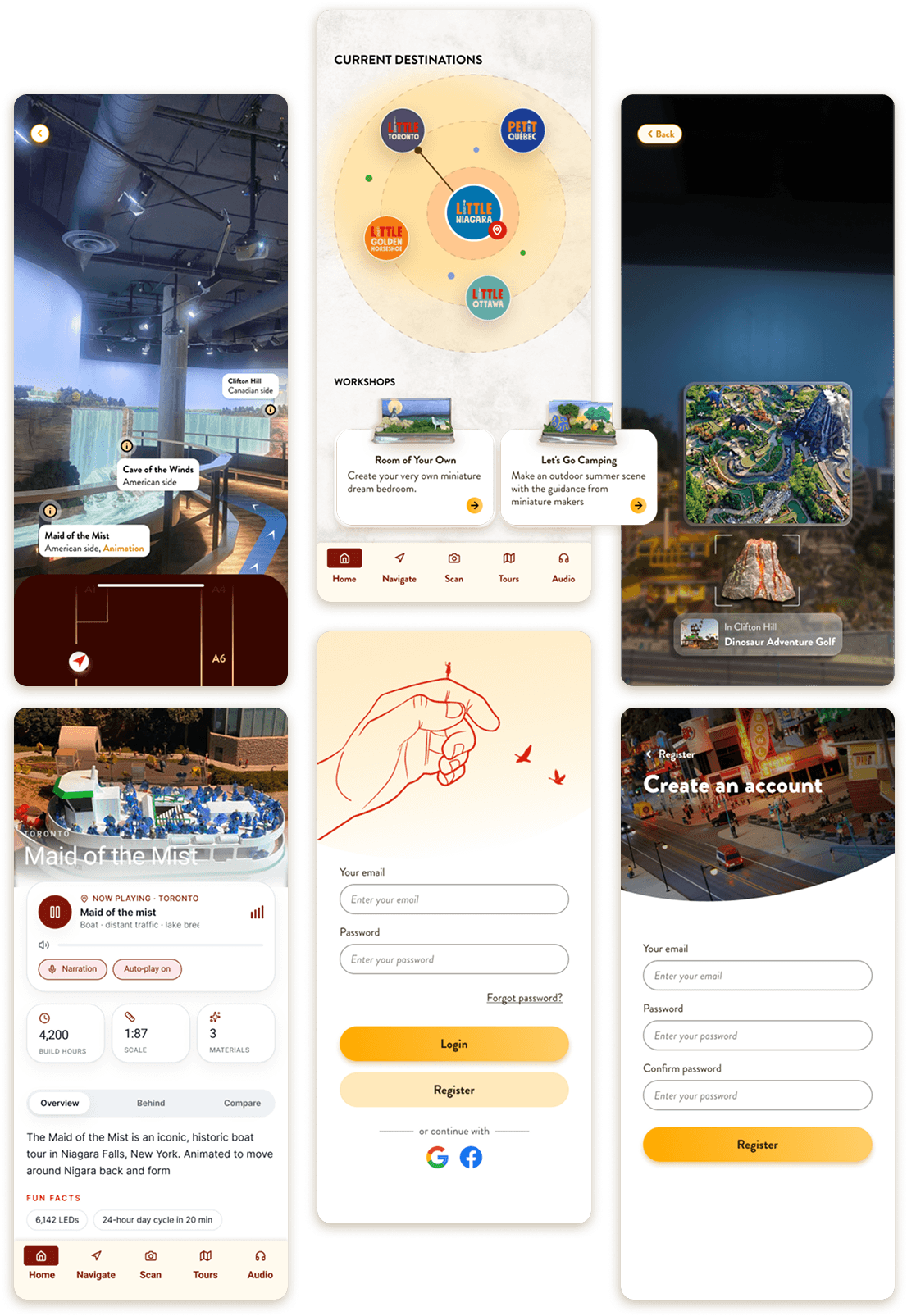
High-fidelity screens of the Miniature Exhibition app showing visitor navigation, exhibit details, and interactive behind-the-scenes content.
Figma File
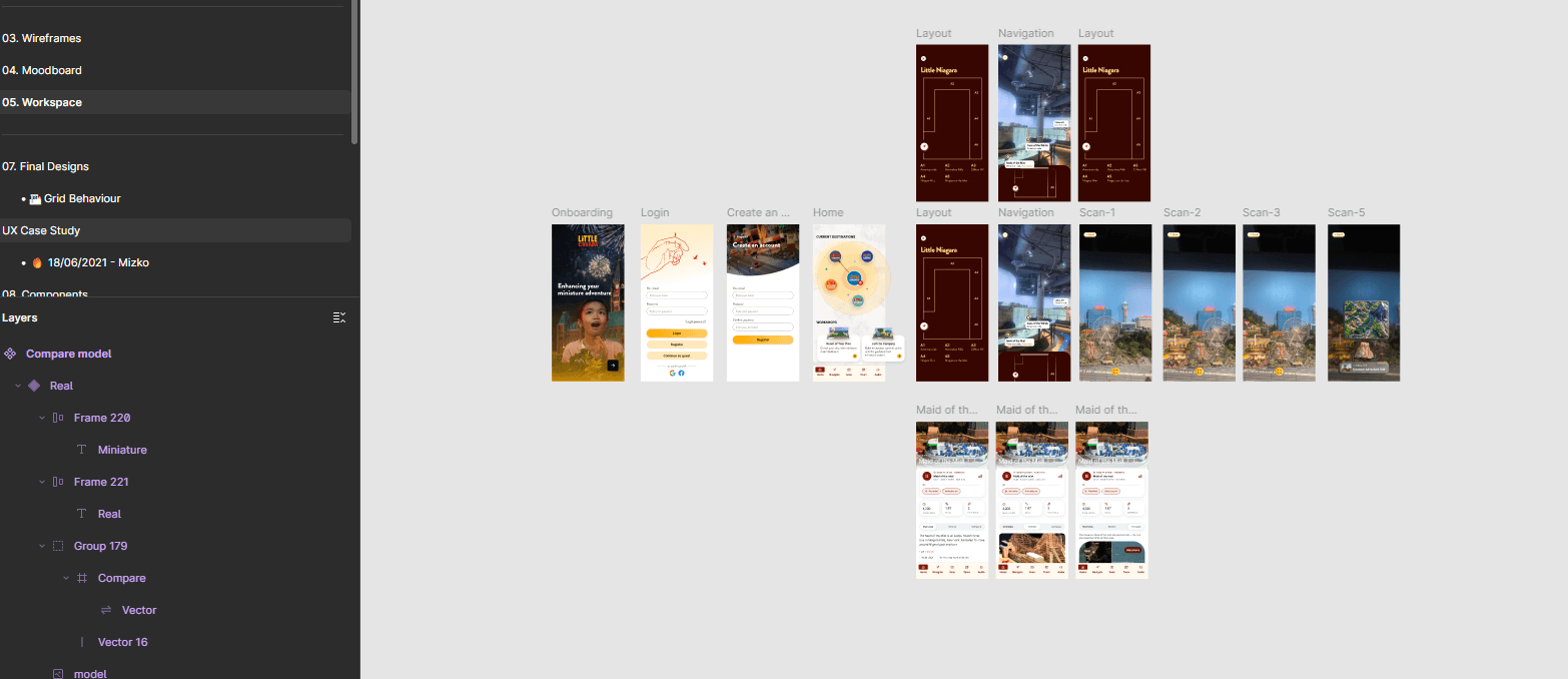
A snapshot of my Figma file.
02
/see more