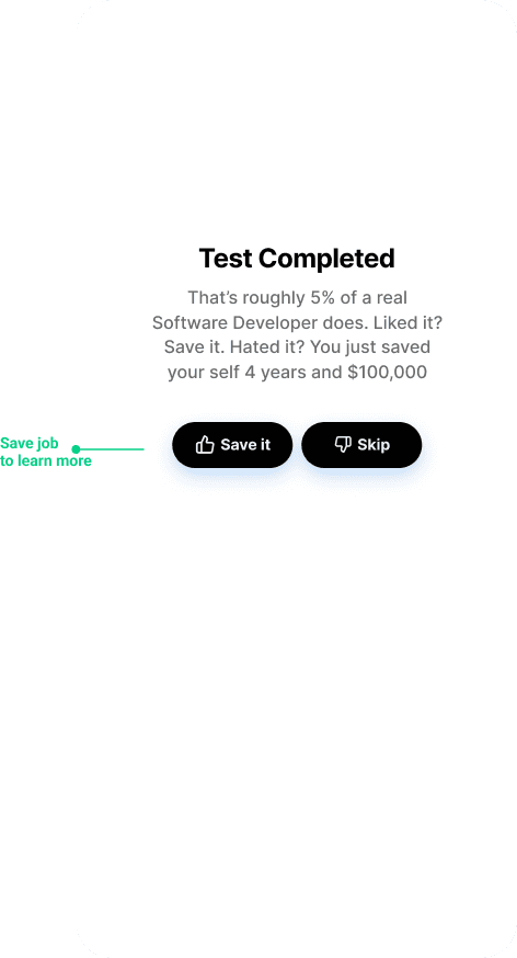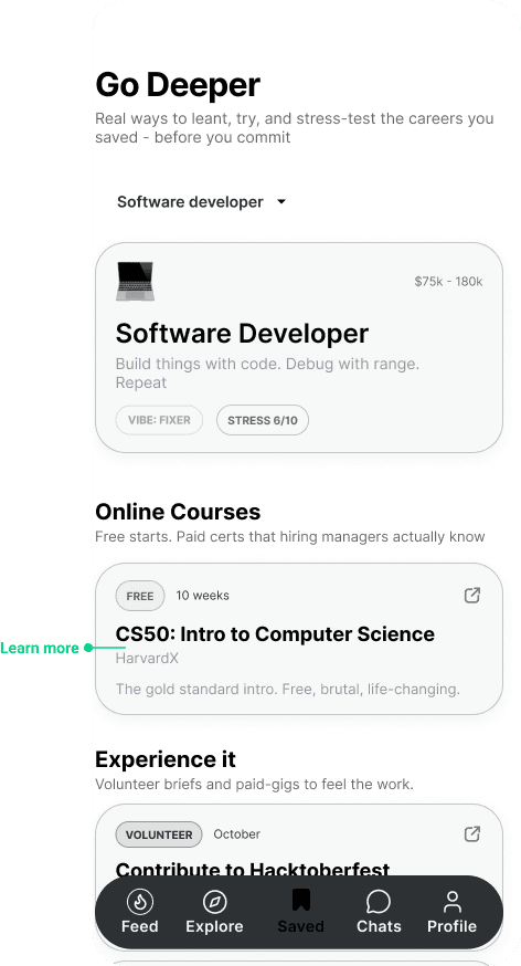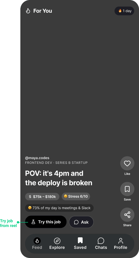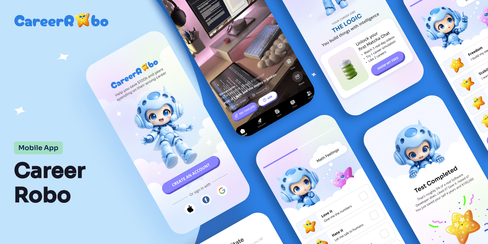
Three high-fidelity mobile application screens demonstrating the Career Guide app interface. The left screen shows a TikTok-style 'For You' video feed featuring an engineering video captioned 'POV: it's 4pm and the deploy is broken.' The right screens showcase a clean 'Explore' dashboard with colorful job category tags like Software Developer, UX Designer, and Cybersecurity Analyst, alongside a 'Go Deeper' section offering a curated 'Intro to Computer Science' course card.

INCOR / 2025

UX/ UI Designer


About project

A mobile-first app that helps students explore careers through real, unfiltered experiences instead of guesswork. It combines a TikTok-style feed of honest “day-in-the-life” content, quick interactive simulations to try real tasks, and low-pressure chats with professionals—allowing users to discover, test, and validate career paths before making decisions.

What I did

Market Research

Competitive analysis

User survey

Flow diagrams

Wireframes

Prototype

High-fidelity UI

Accessibility evaluation

Market Research

The Promblem

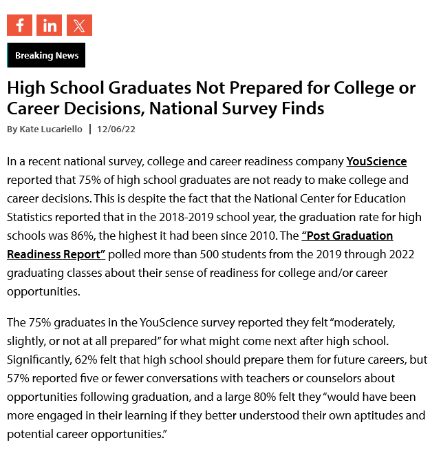
The modern career journey is defined by a "discovery deficit." 75% of high school graduates feel unprepared to make career choices, which leads to 50% to 75% of college students switching their majors at least once. This lack of early direction has long-term consequences: 50% of all workers—and 70% of Millennials—now regret their career path.

The Solution

The solution is to shift career decisions from guesswork to guided discovery. By giving students early access to personalized career exploration—through real-world insights, skill assessments, and clear roadmaps—they can make informed choices before committing years and money.
A dark blue rectangular graphic displaying a financial data chart titled 'Median Revenue Growth Rates for SaaS Companies by ARR Size,' featuring a vertical bar graph mapping growth percentages against annual recurring revenue milestones.

Competitive Analysis

I analysed 3 most popular platforms in the field - looking both at the user experience and negative app store comments to find patterns

logo of Forage
logo of Forage
logo of Xello
logo of Mindler
logo of Mindler

Forage

Xello

Mindler

The good

Leading career platforms like Forage, Xello, and Mindler already provide strong foundations for career discovery by offering structured guidance, personalized career recommendations, and exposure to different career paths through assessments or simulations. They help students understand their interests, align them with potential careers, and in some cases gain practical insight into real-world tasks, making them valuable tools for initial exploration and informed decision-making.

The bad

Despite their strengths, platforms like Forage, Xello, and Mindler fall short in delivering an engaging, reality-first experience. Forage’s simulations are often too long and feel like formal training rather than quick exploration, Xello relies heavily on structured assessments that feel institutional and lack real-world context, and Mindler focuses on psychometric testing that keeps career discovery theoretical instead of experiential. None of these platforms combine real, unfiltered day-to-day job insight, low-friction interaction, and human connection, leaving students still unsure what careers actually feel like in practice.

Problems from the comments

I feel like I'm working in a void because there is no personalized feedback to tell me if my approach was actually correct

woman wearing black crew-neck shirt

HANA

Forage User

I feel like I'm working in a void because there is no personalized feedback to tell me if my approach was actually correct

woman wearing black crew-neck shirt

HANA

Forage User

The platform feels like a repetitive school chore that I just click through to finish rather than a tool for real discovery.

man standing near white wall

ROB

Xello User

The platform feels like a repetitive school chore that I just click through to finish rather than a tool for real discovery.

man standing near white wall

ROB

Xello User

I enjoyed the initial tests, but the high price of actual guidance makes finding a career path expensive and I don't know if it works so I skipped.

man in black crew neck shirt

ANDY

Mindler User

I enjoyed the initial tests, but the high price of actual guidance makes finding a career path expensive and I don't know if it works so I skipped.

man in black crew neck shirt

ANDY

Mindler User

User Survey

I started with a broad hypothesis that a career exploration app could help students make more confident decisions, but at the beginning it was unclear what features would actually be most useful or how students truly prefer to explore careers in practice. To better understand their real needs and pain points, I conducted interviews with high school and early university students to explore how they currently discover career paths, what influences their decisions, and where they feel most confused or unsupported in the process.

What is the biggest thing you wish you knew about your current career path (or major) before you actually started it?

8

participants

Interactive Elements

80%

Building Process

75%

Architectural Comparisons

60%

Educational Value

34%

Notable Comments

“I thought I wanted business, but I have no idea what people actually do in it day to day.”

closeup photography of woman smiling

Maya

High School Student

“The workload and stress are way higher than I expected, it doesn’t feel like what I saw online.”

woman in white crew neck shirt smiling

Sofia

“The workload and stress are way higher than I expected, it doesn’t feel like what I saw online.”

“I wish someone showed me real examples before I chose this, not just the fun parts.”

men's gray crew-neck shirt

Daniel

Design Student

Initial research shows

Students struggle to make confident career decisions because traditional tools feel boring, abstract, and disconnected from real work. To address this, CareerGuide transforms career exploration into a TikTok-style, dopamine-driven experience that keeps users engaged while learning through action. The MVP also includes a “5-Minute Test Drive” that lets users quickly experience real job tasks through interactive simulations, and a “Coffee Chat” feature that enables low-pressure conversations with professionals for fast clarity and guidance. Together, these features turn career discovery from passive reading into an engaging, experience-first loop that helps students explore careers in a more realistic and motivating way.

Flow Diagram

To out line all the necessary functionality I created a simple flow diagram of the main tasks users can do. One of the flows is shown below.

Main Client Flow

A user flow diagram illustrating the core navigational pathways of the mobile application. The flowchart maps out sequential user steps using connected nodes, starting from user onboarding, branching into exploring the 'Day in the Life' video feed, initiating a 5-minute interactive job simulation task, and concluding with a pathway to request a low-pressure messaging session or 'Coffee Chat' with a career professional.

Low-fidelity Wireframes

Once the flow is established , I stared creating the low-fidelity wireframes of the main flow.
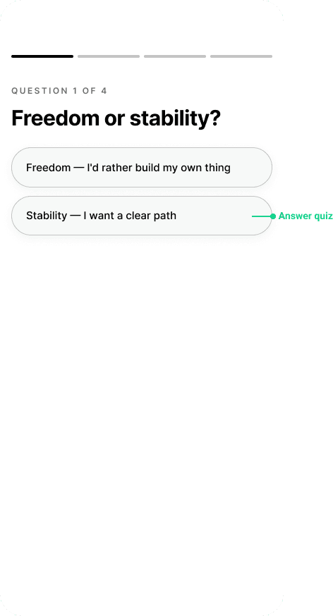
A monochrome mobile wireframe screen detailing the initial app onboarding or career selection stage. The top contains a prominent 'Career Quiz' banner graphic, followed by three large vertical content blocks with text lines and checkmarks, allowing users to pick or view targeted fields of interest before navigating via a fixed bottom menu bar.
A monochrome mobile wireframe showcasing a video-first 'Day in the Life' layout. The screen features a large, full-bleed vertical image or video placeholder block. Overlayed at the bottom are text lines indicating a job title and short description, alongside circular button icons for user interactions like liking, sharing, or asking questions.
A monochrome mobile wireframe layout for a 'Test Drive' or job simulation overview. The top displays key summary metrics (such as task duration or skill tags). Below this is a large rectangular illustration or video placeholder, followed by a detailed paragraph block and a primary call-to-action button at the bottom reading 'Start Simulation'
A monochrome mobile wireframe depicting a professional 'Coffee Chat' or community interaction page. The layout displays a grid of profile cards—each containing a circular avatar placeholder, name text lines, and a job title—allowing users to select and message a professional in their field of interest.

High-fidelity UI Design

Once the initial flow was complete. I started by creating a couple of the main screens of the app. I started by defining the fonts and colors

Color palette

Accent, primary, secondary, background

Main CTA button color

Font

Inter
AaBbCcDdFfGgHh

AaBbCcDdFfGgHh

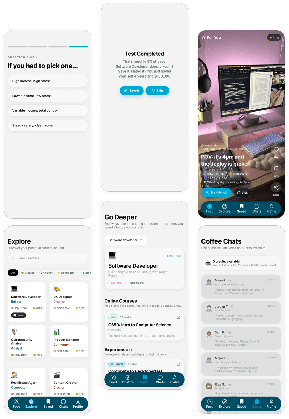
seven polished high-fidelity mobile screens displaying onboarding flows, career discovery cards, interactive simulations, and professional chat screens.

High-fidelity walkthrough of the Career Guide app showing onboarding quiz, TikTok-style Real-Day career feed, 5-Minute Test Drive simulation, and Coffee Chat messaging.

Figma File

A snapshot of my Figma file.
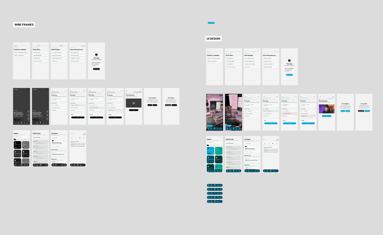
A comprehensive design file snapshot showcasing the mobile application's style guide and final high-fidelity screens. The top left corner displays a clean typographic hierarchy using the 'Inter' typeface, alongside an interface color palette highlighting dark blue, teal, light cream, and a bright yellow accent swatch labeled 'Main CTA button color.' Below the design components, seven polished mobile UI mockups are neatly laid out on a light gray workspace canvas, detailing a step-by-step product walkthrough that spans onboarding question cards, interactive career discovery boards, video streaming feeds, and a direct messaging screen.

Create a free website with Framer, the website builder loved by startups, designers and agencies.